
Monday, September 26
at 6:16 p.m.
I've pretty much completed the layout, but I have found to my dismay that Internet Explorer does not display things as they should be.
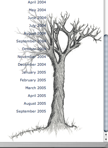
In more detail, the sketch of a tree in the bottom right-hand corner appears too far to the right. And... Well, in this case, a picture of how things should be is certainly better then the dozens of words I could write in an attempt to explain.
I'm going to keep looking into it, but I would like to kindly suggest that you consider obtaining a better browser if you're still using IE.
More in a bit.
And in case you're wondering: yes, I did draw the tree.
I know, I know... I'm just full of surprises.
Edited at 10:23 PM:
As Jon pointed out in his comment, the rendering error I'm referring to is actually only seen - as far as alignment is concerned - when the post is short. So, click on the "And We're Back!" link under recent posts and you'll see what I mean.


I just checked the pages using Firefox on a Mac and a PC and it displays almost perfectly. Only the vertical alignment of the 'Recent' is a bit off.
Oh, I suppose I should have added that you need to view a shorter post - like the "And We're Back!" to truly see what I mean.
Any difference?